Orchids of Light Foundation PROJECTS: Logo Design | Business Card Design
Logo Design
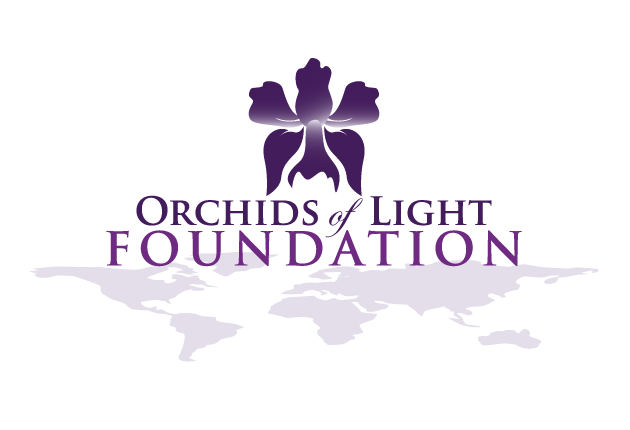
I designed this logo for a non-profit seeking to help already-established non-profits in third world countries. The clients wanted to convey a sense of community around the world by incorporating a map. Once the design was finalized, they requested a second version of the logo with the addition of orange for use on their web site, which featured lots of orange elements.
Business Card Design
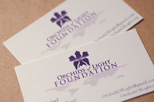
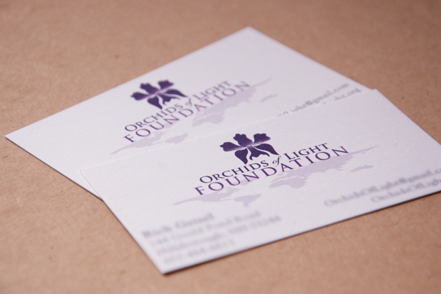
I designed a matching business card as well, utilizing the newly-designed logo. We selected a heavier paper stock to make the cards feel more substantial. The heavier paper also helped convey a sense of professionalism, but since it was a subtle upgrade, it didn’t make the card feel flashy or over-the-top, neither of which are good adjectives to describe a non-profit. Even though this is a young organization, the founders are serious about their mission. If we had used flimsy, perforated paper from the dollar store, the business cards wouldn’t have read as professional, which could have resulted in people questioning the legitimacy of the foundation. If you want others to take you seriously, you have to take yourself seriously. We accomplished this, in part, by using quality paper. This is a perfect example of how every decision in the design process matters.
